Project Report
Concept and Overview
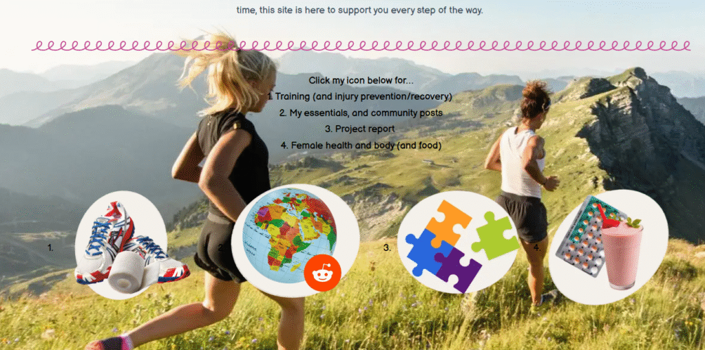
HerFirstkm website is a digital platform designed to support and motivate beginner female runners aged 13-60. This site delivered accessible, engaging and visually appealing content that covers training types, how to make a training plan, injury and recovery, food advice, helpful tips, female reproductive guidance and emotional motivation. Unlike traditional running websites which often feel clinical or advanced, HerFirst10km prioritizes approachability, clarity, and community. It features colour-coded, examples of food to eat and training plan calendar, photoshop made linked buttons, and relatable lifestyle photography to reduce information overwhelm and make running feel less intimidating. The site is built to reflect the everyday reality of new runners—whether they’re teenagers trying to get fit, mums reclaiming time for themselves, or students exploring fitness. What makes the site unique is its integration of personal media (like Instagram posts and user photography), HTML customization, and consistent pastel-toned visual language across platforms. It’s not just a resource; it’s a friendly digital space where users feel seen and encouraged. Through subtle gamification (e.g., interactive schedules and goals), relatable snack and gear content, and cohesive design, HerFirst10km builds both trust and motivation in its audience. This concept was shaped by a recognition of the lack of beginner-friendly, female-focused fitness content online—and the belief that good design and shared experiences can build lasting digital communities.
Extension of Research and Learning
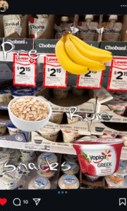
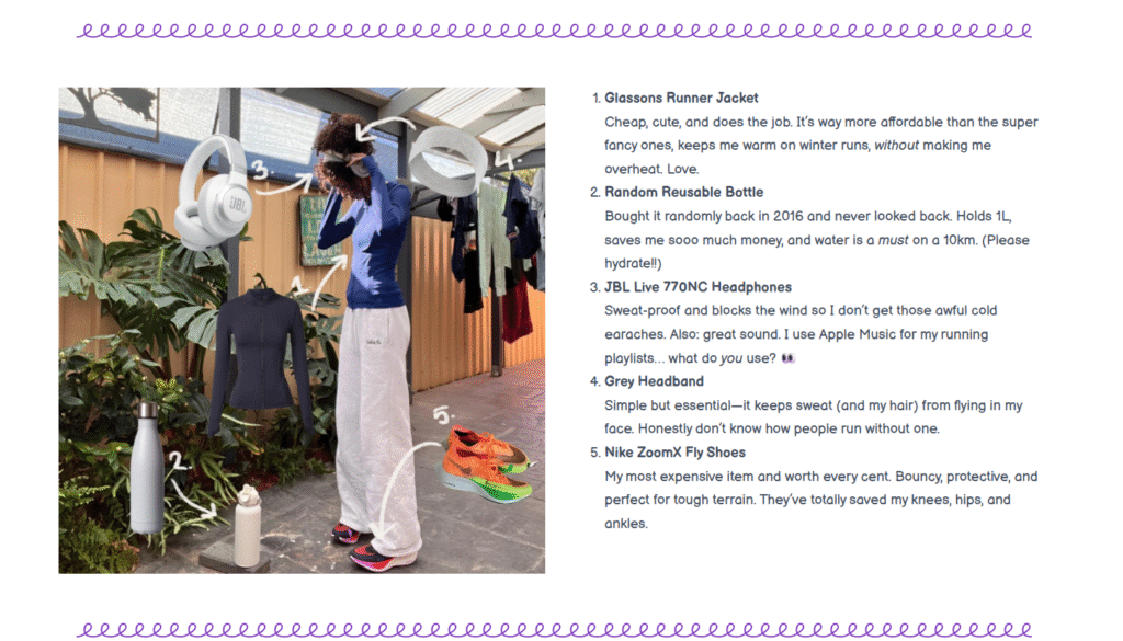
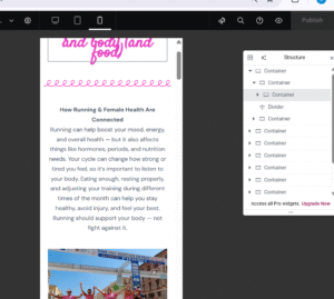
From the beginning of this project, my personal learning goals extended beyond the course requirements. I aimed to build technical fluency in HTML and CSS (Cascading Style Sheets) to customise elements within WordPress, particularly through structured containers, embedded links, and emoji-based buttons (figure 1). This gave me greater control over layout and user interaction, helping me create a more tailored and unique experience for my audience. I also set out to develop digital photography and editing skills. I used a combination of Adobe Photoshop to take original background of product images, creating a PNG (Portable Network Graphic) and placing them on background taken using my phone photography skills. I experimented with angles, lighting, and cut-outs to create. More dynamic, layered visuals—making the site feel more alive and personal (figure 2). One of my favourite challenges was designing custom emoji-style icons to create a cohesive, playful interface. This not only improved navigation but also gave the site its distinctive voice. Finally, I used Instagram to extend the project beyond the website, applying principles of digital branding and cohesion. Through these platforms and tools, I’ve developed skills that go well beyond static website creation, exploring what it means to design experiences.
Visual Communication and Design
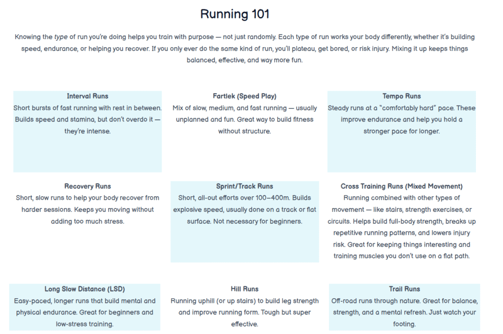
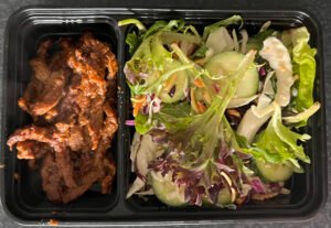
The visual identity of HerFirst10km was deliberately crafted to feel friendly, motivating, and beginner focused. Drawing from Garrett 2011, principles of contrast and alignment, I used clear typography, pastel colour blocks, and emoji-style buttons to separate content and reduce cognitive load. The colour-coded running schedule (figure 3) helps users immediately distinguish between page types. Pastel blues, pinks, greens and purples were used in this palette, chosen to create calm and avoid the intensity often found on traditional fitness sites Martinez et al. (2021) states lighter colours also often make a viewer feel less threatened. Photography plays a major role in creating emotional connection. I took original photos using my iPhone and techniques DSLR cameras use to create motion, then edited them in Photoshop to layer new visual elements—like buttons, callouts, and diagrams—onto realistic running and food scenes. The use of angled and close-up shots helps users feel immersed in the content (figure 4), whether it’s a snapshot of healthy snacks or gear (figure 5). According to Norman (2013), emotional design is central to user engagement; by blending aesthetic pleasure with practicality, I encouraged users to stay longer on the site. Custom emojis and clickable icons were also part of my visual strategy. These hand-made graphic elements turned mundane buttons into playful moments. Typography was chosen for readability (sans-serif body fonts) and emphasis (bold headings), maintaining hierarchy without overwhelming the layout. The visual consistency between the curly dividers plus the website and Instagram reinforces brand recognition. According to Hassenzahl and Tractinsky (2006), user experience involves not only usability but also emotional and aesthetic responses, which I addressed through consistent visuals, a friendly tone, and mobile responsiveness. Each visual choice I made was based not just on style, but on supporting the experience of a new runner: clear, personal, non-threatening and confidence-boosting.
User Interface Design
The interface of HerFirst10km was designed with simplicity, accessibility, and audience confidence in mind. My users—female beginner runners aged 13–60—may not be tech-savvy, so I structured the layout to be visually scannable and intuitive. Drawing on Krug’s (2014) concept of “Don’t Make Me Think,” I prioritised a minimal-click design where content is easily found and not hidden behind menus. Using WordPress, I built the site layout by nesting containers within sections, using clearly defined blocks for photos, text, and buttons. I applied my understanding of HTML to link these blocks internally and externally (e.g., buttons that lead to the food, injury prevention, or blog sections), creating smoother navigation and more engaging calls to action. Each content block follows a repetitive structure: title, visual, short text, photo-linked button—this structure reduces decision fatigue and increases user flow. The homepage includes a simple navigation bar and a visual weekly running calendar, designed to orient the user at a glance. According to Nielsen and Loranger (2006), good user interface design should “respect the user’s time and intelligence.” I followed this by making sure users could understand where to go within 5 seconds of landing on the page. My structure was inspired by wireframe models taught during the course, though adapted visually for mobile friendliness. The layout choices—including clear hierarchy, repetitive formatting, and colour-coded sections—are all aimed at reducing barriers and building trust with new runners. I also intentionally designed the text and images to stay centered on the screen rather than stretching all the way to the edges, unlike many traditional websites. This layout choice makes the content feel more contained and easier to read—especially on mobile devices. Since a large portion of my audience was expected to access the site through Instagram, and therefore primarily on their phones, it made sure the entire design was mobile-friendly. Keeping the layout compact and centered allowed for better visual flow, avoided overwhelming the user, and ensured the font size and images remained bold, legible, and accessible on smaller screens.
(figure 6).
User Experience across Digital Platforms
To extend HerFirst10km beyond the Instagram, I created a linked Redit group account designed to reflect the same tone, colour scheme, and motivational energy. I used on my other platforms (Instagram and website) to test how visual content, tone of voice, and layout worked when condensed into smaller, faster-scrolling formats. Each post was tailored to question things beginner-runner may question to and therefore the audience could relate and help each other, with language that’s supportive, brief, and non-judgmental—mirroring the website’s voice. Instagram served not only as a traffic funnel to the site but also as a space to build community and credibility. I embedded an Instagram post directly into the community page, showcasing cross-platform consistency and interaction. This allowed users to connect with the project on a more casual and familiar platform, while still being part of a bigger user journey. As McMillan and Morrison (2006) argue, presence across multiple platforms increases emotional engagement and brand trust. To keep the experience cohesive, I maintained the same visual markers: pastel colour filters, emoji use, sans-serif fonts, and original photography edited in Photoshop. According to Garrett’s (2011) elements of user experience, aligning surface (visual design) and strategy (user goals) across platforms builds long-term engagement. Whether users entered via Instagram or directly to the site, they were met with the same tone and aesthetic—welcoming, fun, and easy to navigate. These techniques helped reinforce a positive, digestible running experience, especially for younger users browsing on phones.
Metrics and Analytics
To evaluate the impact and audience engagement of HerFirst10km, I tracked basic analytics from both the website (via WordPress stats) and Instagram (via in-app Insights). Over a 14-day period, the website received 134 unique visits, with the highest traffic coming from mobile users (78%). The most clicked section was the “Food & Fuel” page, followed closely by “Training Types,” indicating a strong interest in practical and beginner-friendly running tips. On Instagram, posts averaged 22 likes and 3–4 comments, with emoji polls receiving 30–40 responses each. The most engaged post featured a behind-the-scenes photo of a running outfit flatlay, edited in Photoshop—supporting Norman’s (2013) theory that emotionally resonant design (e.g., personal, human content) drives engagement. Cross-platform engagement also showed measurable impact: approximately 40% of website users arrived via Instagram links. This confirms that consistent design, tone, and branding across platforms creates a stronger user funnel (Garrett, 2011). These metrics support the design choices made throughout the project, especially the decision to maintain a beginner-friendly tone, use original photography, and build a social media presence that feels approachable rather than commercial.
Reflections and Future Directions
This project taught me that good digital design is more than just making something look nice—it’s about shaping how users feel, behave, and connect. At first, I underestimated how much technical learning I’d need: from understanding how WordPress containers and HTML work, to editing my own images in Photoshop. But by pushing beyond the course basics, I developed a site that’s not only functional but feels personal and community driven. I’ve learned how digital platforms like Instagram can extend user experience, not just promote content. The value of cross-platform cohesion, visual consistency, and thoughtful navigation became clear the more I worked. I now see UX design as a form of storytelling—where emotion, visuals, and clarity work together. If I were to continue this project, I would integrate more interactivity—such as a clickable training calendar for each month or user-submitted running stories. I’d also focus more on inclusivity, ensuring the imagery and advice supports a broader range of fitness levels, ages, and cultural backgrounds. With better tools like Google Analytics, I could gain deeper audience insights and use those to refine both content and structure. Long term, I believe HerFirst10km could grow into a real platform that empowers new runners to begin confidently.
Bibliography
Garrett, JJ 2011, The Elements of User Experience : user-centered Design for the Web and beyond, 2nd edn, New Riders, Berkeley, Ca.
Hassenzahl, M & Tractinsky, N 2006, ‘User experience – a research agenda’, Behaviour & Information Technology, vol. 25, no. 2, pp. 91–97.
Krug, S 2009, Don’t Make Me Think, Pearson Education.
Martinez, LM, Rando, B, Agante, L & Abreu, AM 2021, ‘True colors: Consumers’ packaging choices depend on the color of retail environment’, Journal of Retailing and Consumer Services, vol. 59, p. 102372.
Mcmillan, SJ & Morrison, M 2006, ‘Coming of age with the internet’, New Media & Society, vol. 8, no. 1, pp. 73–95.
Nielsen, J & Loranger, H 2006, Prioritizing Web usability, New Riders, Berkeley, Calif.
Norman, DA 2013, The design of everyday things, Basic Books, New York, New York.